Introduction
BuddyBoss does not include a built-in option to hide page titles specifically for mobile devices. By default, page titles appear on all screen sizes. If you want to hide page titles only on mobile screens, you can use a custom CSS snippet targeting smaller devices.
Custom Workaround
- Go to BuddyBoss > Theme Options
- Under Custom Codes, enable CSS
- Append the following CSS code:
@media (max-width: 768px) {

    .page.buddyboss-theme header.entry-header {

        display: none;

    }

}- Click Save changes
This will hide page titles only on screens with a width of 768px or less (typical mobile devices).
Troubleshooting and FAQs
Q: Will this hide titles on tablets too?
A: This targets screens 768px wide and smaller, so most tablets in portrait mode may also be affected.
Q: Can I combine this with the desktop hide code?
A: Yes. You can keep separate rules for desktop and mobile to control visibility per device.
Q: How do I revert the change?
A: Simply remove the CSS code from Custom Codes and save changes.
Q: Will this affect SEO?
A: No. This only hides the title visually on mobile devices. The HTML remains intact for search engines.
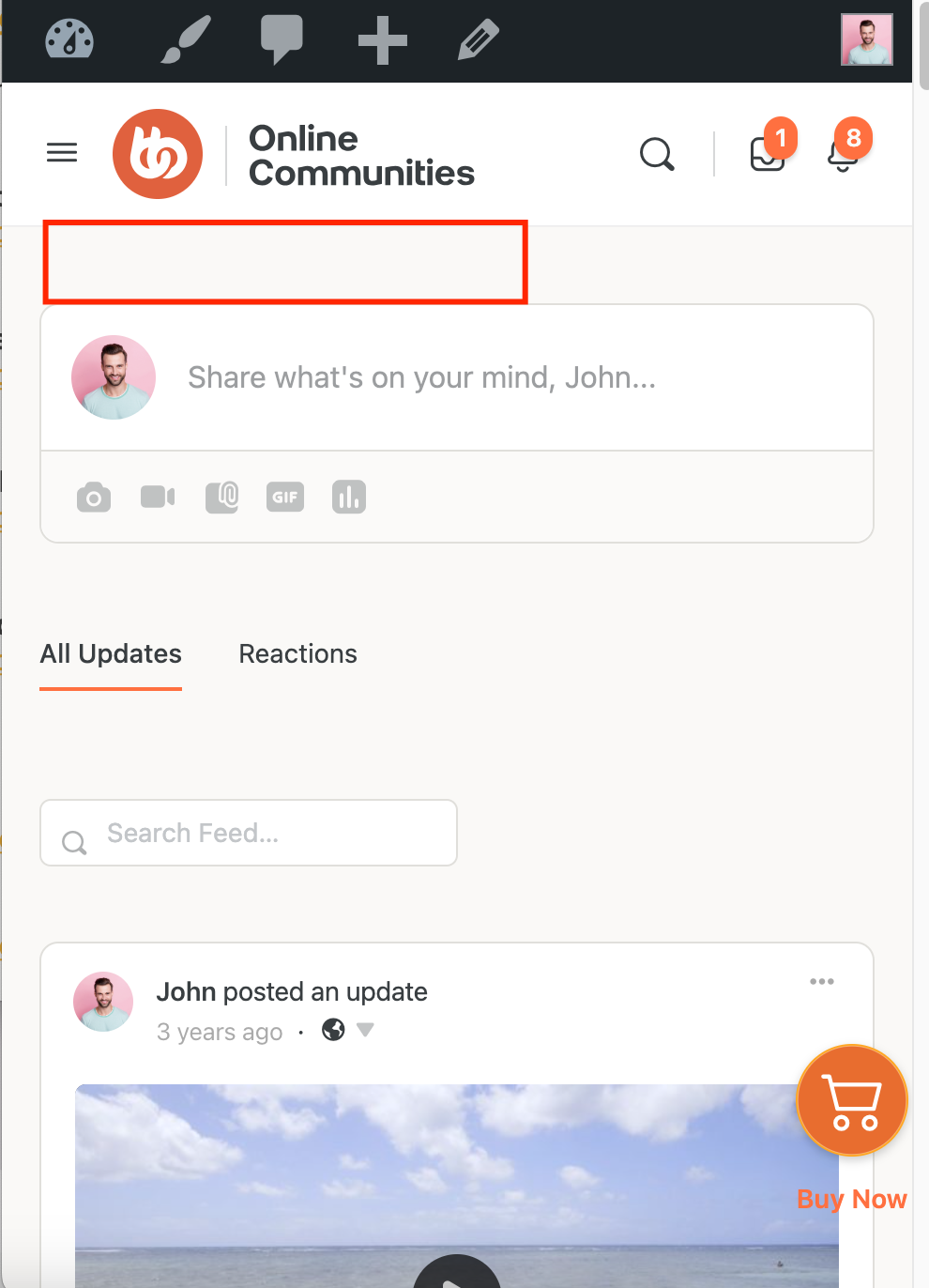
Without the Code:
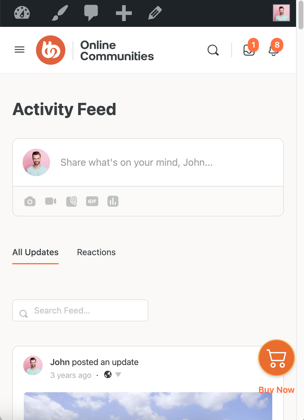
With the Code: