April 29th, 2011.
Game Of Thrones episode 1 had just premiered on HBO. ?
“The Social Network” had recently not won best picture at the Oscars. ?
And just a few days after Obama released his birth certificate to the public, something else was born to the social web:
The First BuddyBoss Theme
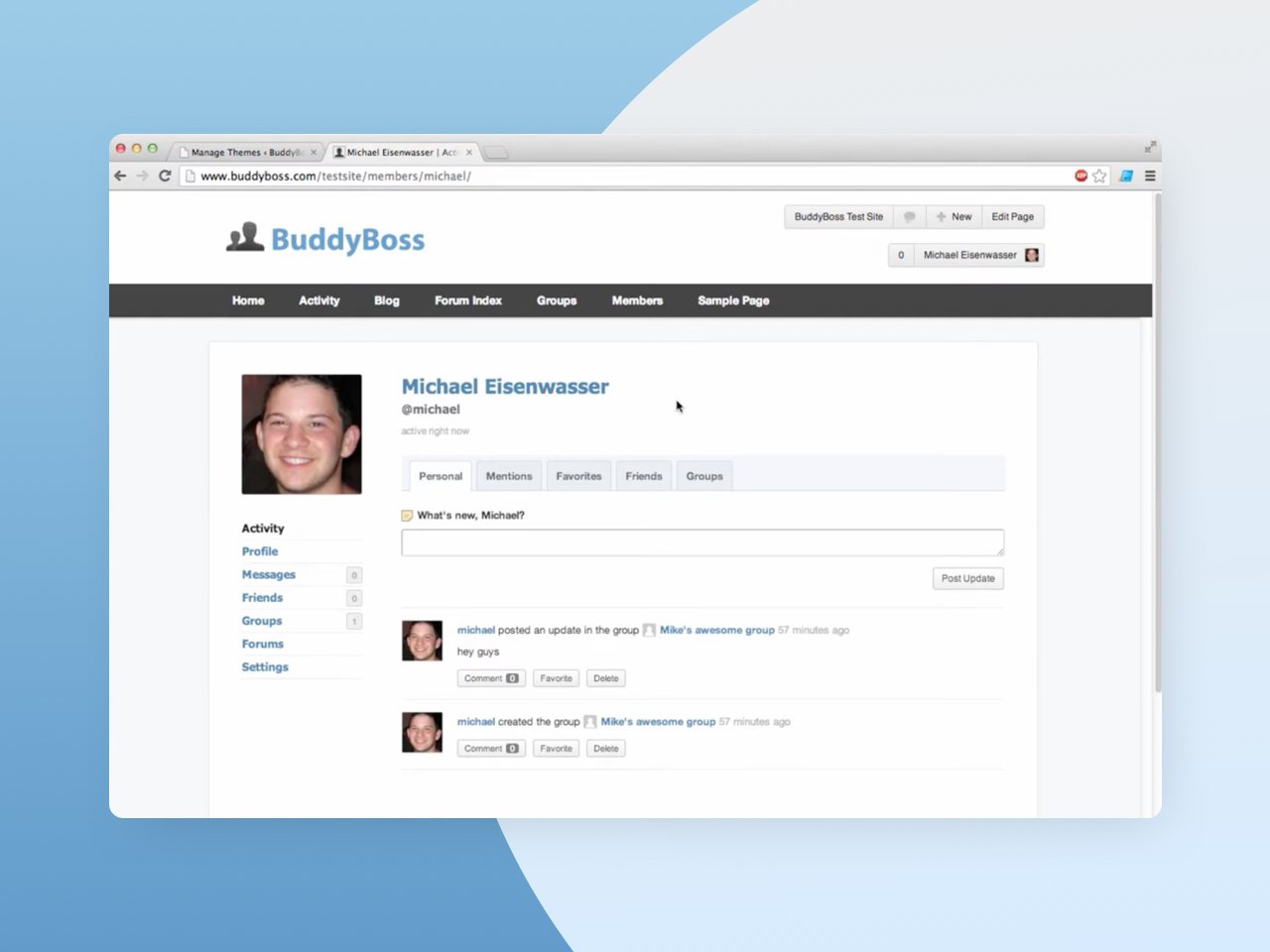
Technically version 1.0.6 of what we now call “BuddyBoss Legacy Theme”, what you see above was our first crack at making an impact on how you create your own social communities with WordPress.
A lot happened in the years that have followed; we released the popular Boss Theme with a focus on social learning, along with various plugins and extensions to help you greatly improve your WordPress community, course & membership sites.
In mid-2018 we released the last update for the original BuddyBoss Theme and on June 7th, 2019 the all-new BuddyBoss Theme & Platform came into the world.
BuddyBoss Theme & Platform v1.0
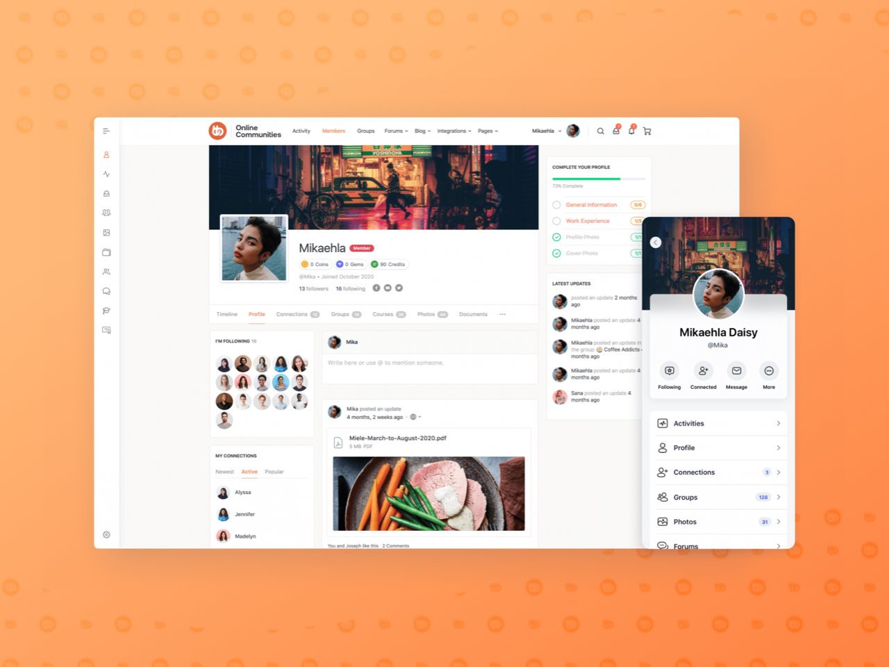
The BuddyBoss Theme & Platform as we now know it was a major innovation in the world of open-source communities, memberships, and course websites.
We took everything we had learned from years of building themes and extensions for BuddyPress, and gathered the best of all our work into a single, unified package; The BuddyBoss Platform, and released it free to the WordPress community.
But we didn’t stop there.
We took everything we had learned about designing beautiful social experiences, combed through every popular platform on the web, and asked ourselves; “how can we do better?”.
I’m sure you’ll agree that, compared to all of the social media giants in 2019… The BuddyBoss Theme was gorgeous! ?
An Explosion of New Social Networks
Since 2019 there has been an explosion of new social networks, community and membership sites on the web, each one bringing some new hook that quickly ripples through to all the other billion-dollar giants as they all scramble to keep up with each other.
It’s an incredibly exciting time to be developing world-changing technology and as we’ve learned through our work on the BuddyBoss App over the last 5 years…
Developing revolutionary technology is an enormous undertaking!
(A mobile app builder for WordPress! ?)
We have always, and will continue to focus our attention on providing you with world-class tools to help you build and grow your own communities, memberships, and online course websites.
But a big part of empowering you with the tools to build your very own world-class platform is helping you make it look and feel just as great as it functions.
So let’s take a look at how we are improving the theme:
BuddyBoss Theme 2.0: A Sneak Peek
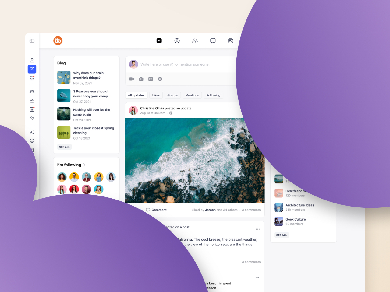
The BuddyBoss ecosystem has advanced leaps and bounds in the last 18 months and this new theme refresh capitalizes on all of the incredible work we have achieved with the BuddyBoss App to create a unified experience for all our BuddyBoss customers.
We are taking many of the design principles that helped make the launch of the BuddyBoss App such a success and infusing them into the BuddyBoss Theme, solidifying our position as the most feature-rich, flexible, customizable, and best-looking community, course, and membership platform in or out of WordPress!
Let’s take a look at some of the highlights.
Please note: All of the images featured in this post are concept designs and anything pictured here could change before we release it to the world!
New Header Styles

One of the most frequently requested features for the BuddyBoss Theme is for more options to customize the look and functionality of the theme header.
BuddyBoss Theme 2.0 will not only come with some great new header styles for you to select from, like the ones above, but in the future we are also going to be adding greater block support to make use of WordPress’s upcoming Full Site Editor which will enable you to go beyond our pre-built header styles entirely and actually create your own headers from scratch!
New BuddyPanel Options
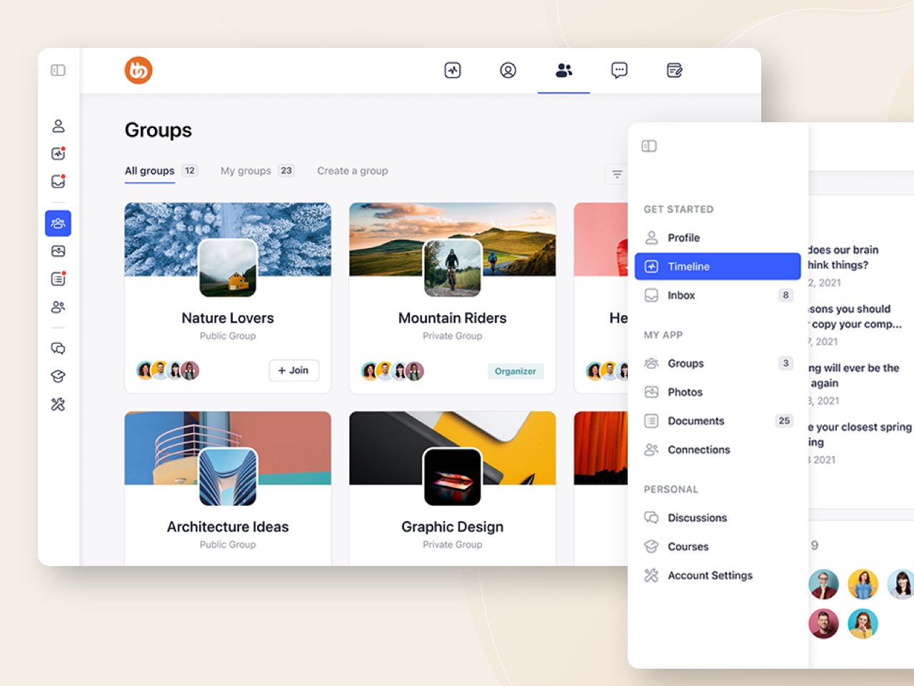
With the BuddyBoss Theme 2.0, we are keen to give you more options to make even better use of the BuddyPanel.
Starting with sections for menu items to help you organize and group your menus and submenus better and lay them out in a way that is more intuitive for your unique setup.
Unified Web & App Experience
I mentioned it above but one of the key drivers of BuddyBoss Theme 2.0 is providing both you and your own users with a unified experience across web and app versions of your platform.
Having invested heavily into the design of the BuddyBoss App we want to expand on that work to make the BuddyBoss Theme look just as great as the App looks and provide you with the same app-like experience you have come to expect from all modern platforms.
We are also keen to make sure that you can deliver that experience to your own site users too so that if you have the BuddyBoss App then your web platform looks and feels the same.
Theme customers will benefit hugely from all of the cutting-edge design work we invested in for the app, and of course, app customers will also benefit from having a unified experience across all platforms.
We’re doing this in a few ways, including:
Updated Icon Sets
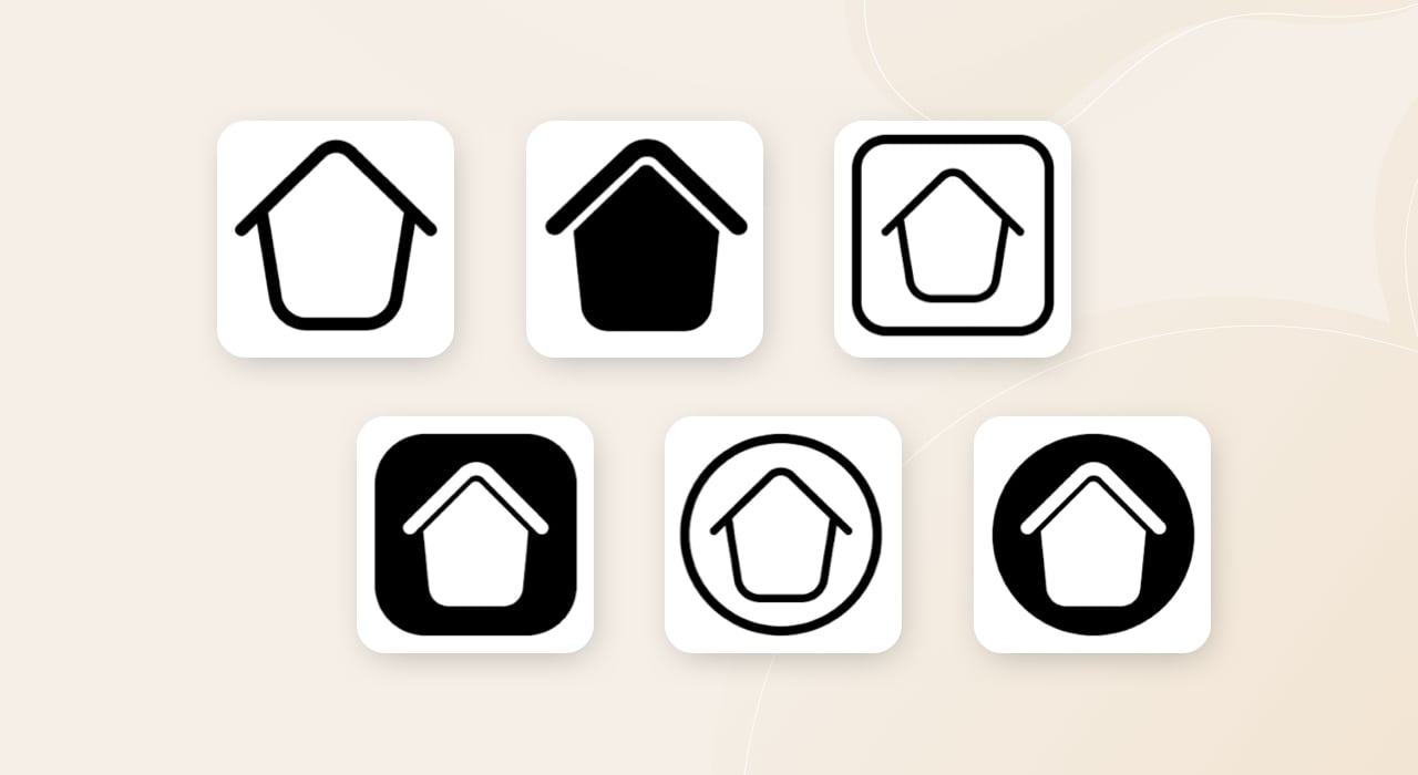
We are updating the BuddyBoss icon set included in our theme to the more modern and visually consistent icon set that we created for the app.
This will come as a welcome addition for many of you who may have been using mismatched icons from different icon sets when you couldn’t find quite the right icon you were looking for.
Now, not only will the icons themselves look better, sharper, more modern, and contemporary, but your layout and styling options will behave more consistently when applied to a single comprehensive set.
As well as this, we will be adding multiple icon styles to each icon so you’ll be able to choose from an outlined or filled icon style, and with a square or circle around the icon too!
Sharing these icons sets across the web and app versions of your platform will create a much more unified visual experience.
Updated UI Elements & Styling
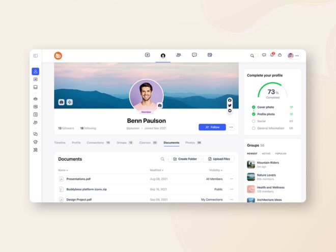
Probably the most impactful enhancement of all, we will be providing an enhanced set of theme options to control more of the UI elements and styling to create that fresh contemporary look and feel.
Widgets and content areas will be allowed more padding, elements will be cleaner, flatter, and simpler and anywhere where it makes sense you will have even more options to control the styling of interactive elements, for example; button styles like rounded, pill, or squared.
Refreshed Default Typefaces, Images & Colors
One of the things we are very keen to achieve with BuddyBoss Theme 2.0 is that the “out-of-the-box” experience looks and feels as modern and contemporary as we can.
That’s why we’ll be shipping 2.0 with a new set of default typography, default images like the default profile and group images, and an updated set of default colors for things like menu highlights, progress bars, notification badges, category tags, and the like.
For all you CSS tweakers, don’t worry! Most of the 2.0 updates will come as optional so you’re not going to lose your hard-earned customizations if you don’t want to.
50+ Widgets Getting a Makeover
As if that wasn’t already enough, we’ll be improving the default styling of over 50 widgets in BuddyBoss Theme 2.0 including:
- 20+ default BuddyBoss widgets
- 10+ GamiPress widgets
- 20+ LearnDash & other widgets
Paving the Way for All New Gutenberg Blocks
All of the new design work being done to refresh the BuddyBoss Theme for version 2.0 will help pave the way for a slew of new Gutenberg Blocks. As Gutenberg gets more and more advanced and WordPress Full Site Editor becomes more and more ubiquitous we will be leaning into the block editor for a number of reasons:
Building Gutenberg First
Enhancing the support for Gutenberg blocks will allow more of you to create your communities, course, and membership sites with a “Gutenberg first” approach, using elements that are part of the WordPress core to greater effect and creating even better page and website parts with just the block editor.
Building Better Experiences With Gutenberg
Increasing our support for Gutenberg and the block editor means your Gutenberg pages and website parts will become more feature-rich and customizable over time. Aside from having more flexibility and options at your disposal, it will also allow us to make great use of Gutenberg’s “Patterns” functionality that’s currently in its infancy.
Unified Creation Experience Across Web & App
We want to marry the creation experience across the web and app together, harnessing the flexibility and control of the WordPress web experience with the power and advanced capabilities of the App. This will allow us to create even better support for React-driven layouts on the web as well as blocks and layouts in the web that are already compatible with the BuddyBoss App and don’t need to be rebuilt.
How 2.0 is Gonna Roll!
With any major update to a widely used (and heavily customizable) platform, you have to take great care to implement changes in a way that causes no disruption to business-as-usual.
While we are confident that all of these updates will be a very welcome sight for most of you, we want to take a second to outline some of the principles that are guiding us so you can be confident that when 2.0 is ready, you’re not going to be hit with any surprises.
1. More Ways To Customise
The main guiding principle of our work towards 2.0 is to give you more ways to customize your own unique web experience. The biggest reason you chose BuddyBoss in the first place was because of its infinite customizability, you don’t wanna be stuck inside a box (or a circle ?) so we’re going to give you even more options than you already have to do exactly what you want.
2. More On-Trend Options
We know that not everyone is a designer, but every one of you wants your community, membership or course platform to look cutting edge and not just to keep up, but to outpace the experiences that your users are having elsewhere. That’s why we’re enhancing our theme options with more on-trend elements your users will be familiar with from other platforms.
3. Applying Improved Default Styling, Where Appropriate
Where it makes sense we will improve the default styling of elements and features where it has become generally ubiquitous, using our best judgment to ensure the best compatibility possible across integrations and extensions.
4. You Control The Pace
When 2.0 is ready to drop, you will be able to control the pace of your own refresh. The theme options you had set previously, for elements such as the header, BuddyPanel, typography, and color options will remain the same until you intentionally switch them after updating. General improvements such as the icon set and widget styling will be made available to everyone after updating. This means that if you’ve invested into your own customizations or enhancements you will be able to keep your previous theme options, while still benefiting from the smaller improvements throughout the theme.
What Do You Want to See?
We’re very excited to get BuddyBoss Theme 2.0 in your hands, we know it’s going to make a huge difference and we can’t wait to hear what you think.
Now would be a great time to get your insight to us; let us know what you’re most excited for and if you have any ideas for things that you’d like to see us develop.

