
The BuddyBoss App Video Carousel block lets you showcase video content in a swipeable carousel in your mobile app. This is ideal for highlighting featured videos, course previews, onboarding content, webinars, tutorials, promotional content, and other video-based resources.
Add the Video Carousel Block
- Open the App Page where you want to add the video carousel.
- Click the + Add Block button or open the Blocks panel.
- Search for Video Carousel.
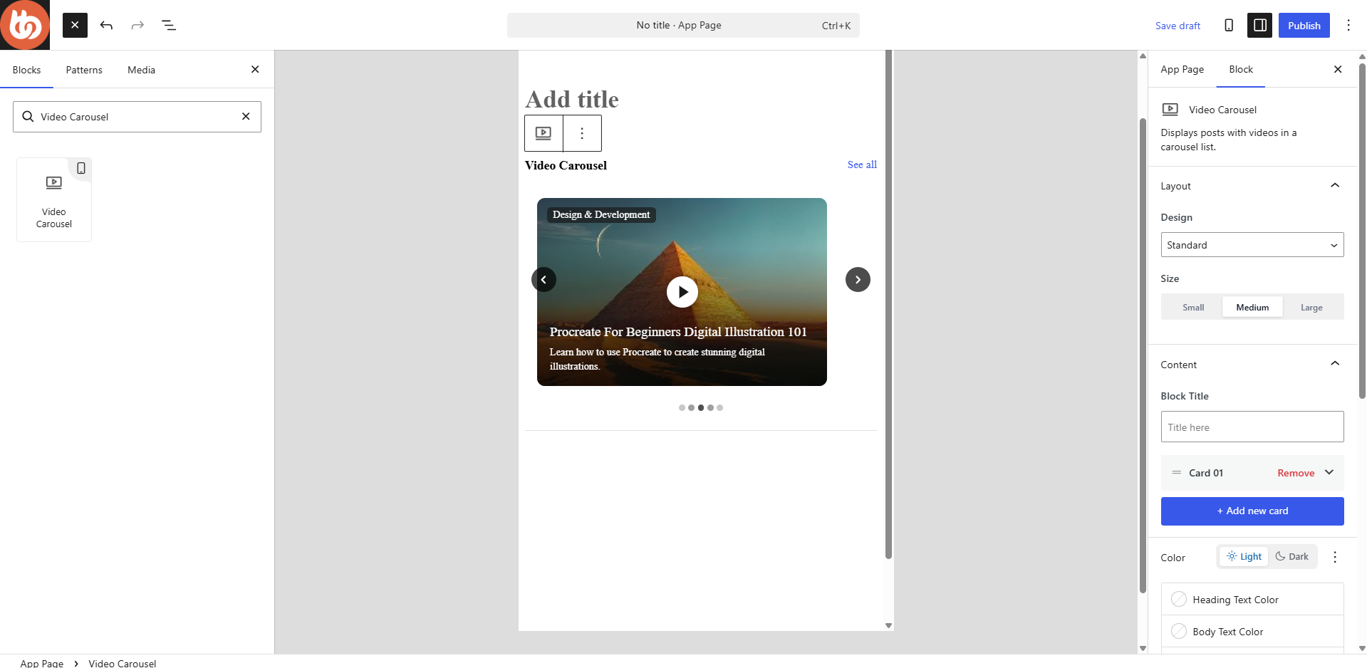
- Drag and drop the Video Carousel block into the center content area of the page editor.
Once added, the block settings will appear in the right-hand panel.
Configure the Layout
The Design dropdown allows you to choose how the carousel is displayed.
Available layouts include:
- Standard
- Full Width
- Split
- Center
- Card
Select the layout that best fits your page design.
You can also choose the display size:
- Small
- Medium
- Large
Add a Block Title
Use the Block Title field to add a heading above the carousel.
If you do not want a title displayed, disable Show Block Title in the settings section.
Add Video Cards
The Video Carousel block allows you to create multiple video cards.
- Click + Add New Card.
- Select how you want to add the video.
- Configure the video content.
- Add supporting text and metadata.
- Repeat the process for additional videos.
You can add up to 10 video cards within a single Video block.
Configure Video Content
Each video card contains several configuration options.
Embed Video
Select Embed Video to display videos from supported video platforms.
- Select Embed Video.
- Paste the video URL into the YouTube/Vimeo URL field.
- Click Pull Video.
The system will retrieve the video information automatically.
Supported platforms include:
- YouTube
- Vimeo
Upload Video
Select Upload Video if you want to upload your own video file directly.
- Select Upload Video.
- Upload your video file.
- Save the card settings.
This option is useful for custom video content that is not hosted on YouTube or Vimeo.
Configure Card Content
Heading Text
Enter the title displayed for the video.
Examples:
- Welcome to the Community
- Course Overview
- Weekly Training
- Product Demo
Body Text
Add a short description to provide additional information about the video.
Examples:
- Learn the basics before getting started.
- Watch this week’s featured training session.
- Discover the key features of our platform.
Meta Data
Use this field to display supplemental information.
Examples:
- Beginner Course
- 10 Minutes
- Featured Video
- New Release
This information appears when Show Metadata is enabled.
Customize Colors
The Color section allows you to customize the appearance of the carousel.
Available options include:
- Heading Text Color
- Body Text Color
- Background Color
Light and Dark Mode
The Profile Card supports both Light and Dark color configurations.
Configure Card Settings
The following display options can be enabled or disabled:
- Show Block Title
- Show Heading Text
- Show Body Text
- Show Meta Data
Disable any elements you do not want displayed within the carousel.
Configure Carousel Settings
The Video Carousel block includes several display and navigation options.
Enable Autoplay – Automatically rotates through carousel slides without user interaction.
Infinite Loop – Allows the carousel to cycle through all videos continuously.
Show Navigation Arrows – Displays previous and next arrows for navigating between videos.
Show Pagination – Displays pagination indicators below the carousel so users can see their position within the slide sequence.