
The BuddyBoss App Icons Block allows you to display a row of icon cards in a swipeable carousel within your mobile app. This block is ideal for creating quick-access navigation, highlighting important features, showcasing services, or directing members to key areas of your app.
Add the Icons Block
- Open the App Page where you want to add the icons carousel.
- Click the + Add Block button or open the Blocks panel.
- Search for Icons.
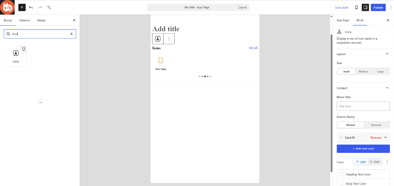
- Drag and drop the Icons block into the center content area of the page editor.
Once added, the block settings will appear in the right-hand panel.
Configure the Block Size
The Icons block supports three display sizes:
- Small
- Medium
- Large
Choose the size that best fits your page layout and content requirements.
Add a Block Title
Use the Block Title field to create a heading above the icon carousel.
If you do not want a title displayed, disable Show Block Title in the settings section.
Choose a Content Source
The Icons block supports two content sources.
Manual – Select Manual if you want to create and manage each icon card individually.
Dynamic – Select Dynamic if you want the block to automatically display content from a configured content source. This option is useful when displaying content that updates automatically.
Add Icon Cards
- Click + Add New Card.
- Configure the icon card settings.
- Add additional cards as needed.
You can add up to 10 icon cards within a single Icons block.
Customize Colors
The Color section allows you to customize the appearance of the Icons block.
Available options include:
- Heading Text Color
- Body Text Color
- Background Color
Light and Dark Mode
The Icons block supports both Light and Dark color configurations.
Important: Dark Mode customization is only available when App Next Gen is enabled.
If App Next Gen is not enabled, only the standard light-mode styling will be applied.
Configure Display Settings
Show Block Title – Enable or disable the block title displayed above the carousel.
Show Heading Text – Enable or disable the heading displayed for each icon card. This is useful if you want to display icons only without text labels.
Configure Carousel Settings
The Icons block includes several carousel behavior settings.
Enable Autoplay – Automatically rotates through icon cards without user interaction.
Infinite Loop – Allows the carousel to continuously cycle through all icon cards.
Show Pagination – Displays pagination indicators below the carousel so users can see their position within the icon sequence.