
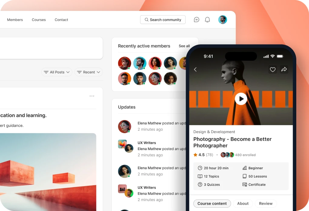
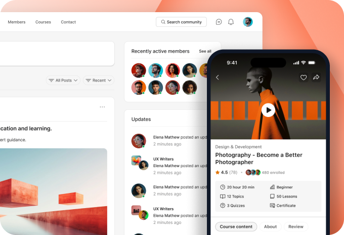











BuddyBoss App NextGen integrates with LearnDash to provide a modern and seamless mobile learning experience. Members can browse courses, view course details, access lessons and topics, and track their learning progress through a consistent interface.
LearnDash screens in App NextGen feature organized course layouts, progress indicators, and support for light and dark modes, providing a consistent learning experience throughout the app.
Enable BuddyBoss App NextGen
To experience how App NextGen works with Learndash, make sure App Next Gen is enabled.
- From your WordPress Dashboard, navigate to BuddyBoss App > App Next Gen.
- Locate the App Next Gen toggle.
- Enable the toggle to activate App Next Gen.
- Review the installation and upgrade checklist displayed on the page.
Once App NextGen is enabled and the required setup is complete, supported LearnDash screens will use the NextGen interface.
Note: BuddyBoss App NextGen supports both Light Mode and Dark Mode for LearnDash screens. To configure these appearance settings, navigate to BuddyBoss App > Branding > Settings in your WordPress Dashboard. Dark Mode is available only when App NextGen is enabled.
LearnDash Colors and Design Settings
When BuddyBoss App NextGen is enabled, LearnDash screens use the BuddyBoss App NextGen design system to maintain consistent styling across course listings, course details, and learning content.
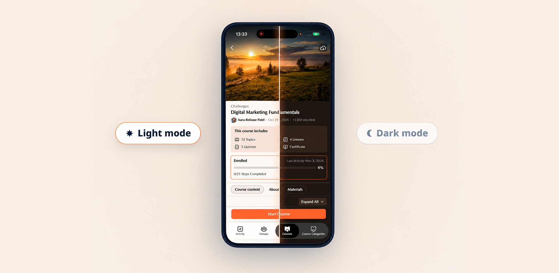
The following design settings are applied to supported LearnDash elements:
| Design Setting | Used For |
| Brand – Primary Color | Progress bars, selected states, and inline links |
| Brand – Secondary Color | Secondary buttons and supporting elements |
| Background – Primary Color | Main course screens and content backgrounds |
| Background – Secondary Color | Course cards, segmented tabs, and content blocks |
| Background – Tertiary Color | Loading placeholders, progress tracks, and supporting containers |
| Border – Primary Color | Course outlines, containers, and section dividers |
| Border – Secondary Color | Lesson dividers and selected interface elements |
| Typography – Primary Color | Course titles, headings, and primary text |
| Typography – Secondary Color | Descriptions, metadata, and supporting information |
| Typography – Tertiary Color | Additional course details and secondary information |
| Primary Button Color | Primary button text and supported button elements |
| Secondary Button Color | Secondary button text and icons |
| Status – Success | Supported assignment success indicators |
| Status – Warning | Supported assignment warning indicators |
Note: LearnDash text links use the Brand – Primary Color setting. The appearance of individual elements depends on the available LearnDash features and course configuration.