
The BuddyBoss App Colors settings allow you to customize the appearance of your BuddyBoss App by defining separate color palettes. You can configure colors for the app interface, typography, buttons, navigation, login screens, Android status bar, and system status messages, with a live preview displayed alongside the settings.
This guide explains how to customize the app’s color scheme.
Enable App Next Gen for Dark Mode Icon Uploads (Optional)
If you want to set different color settings for your BuddyBoss App Light and Dark mode, you must first enable the App Next Gen feature. The Dark Mode option is only available when App Next Gen is enabled.
- Navigate to WordPress Dashboard > BuddyBoss App > App Next Gen.
- Enable the App Next Gen toggle.
Access the Color Settings
- Log in to your WordPress Admin Dashboard.
- Navigate to BuddyBoss App > Branding > Colors.
- Select either Light Mode or Dark Mode.
- Select the section you want to customize.
- Configure the available color settings.
- Click Save Changes.
Note: A live device preview is displayed on the right side of the screen, allowing you to preview your changes before publishing a new app build.
Configure General Colors
The General tab contains the primary colors used throughout your app interface.
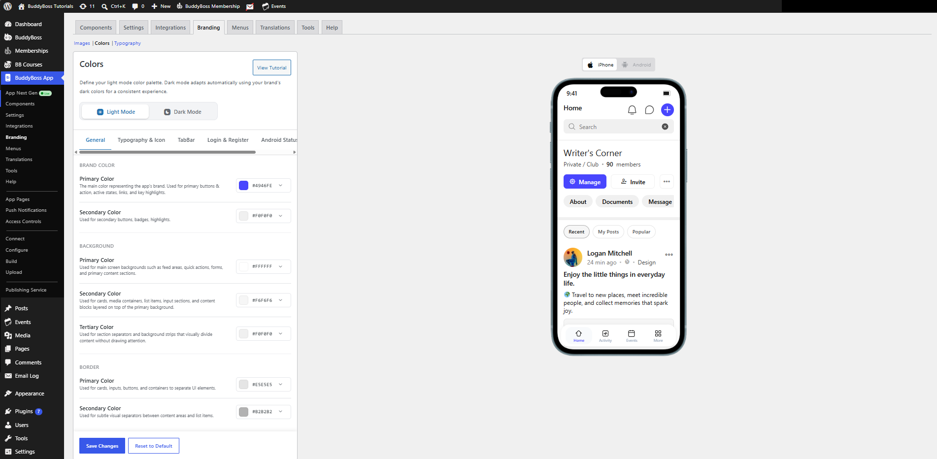
Brand Color
- Primary Color – Used for primary buttons, action buttons, active states, links, and key highlights throughout the app.
- Secondary Color – Used for secondary buttons, badges, and supporting highlights.
Background
- Primary Color – Used for the main screen background, forms, and primary content sections.
- Secondary Color – Used for cards, media containers, lists, content blocks, and input sections layered on top of the primary background.
- Tertiary Color – Used for section separators and subtle background areas that visually divide content.
Border
- Primary Color – Used for cards, buttons, input fields, and content containers.
- Secondary Color – Used for subtle separators between content areas and list items.
Configure Typography & Icon Colors
The Typography & Icon tab controls the colors used for text, icons, and buttons throughout the app.
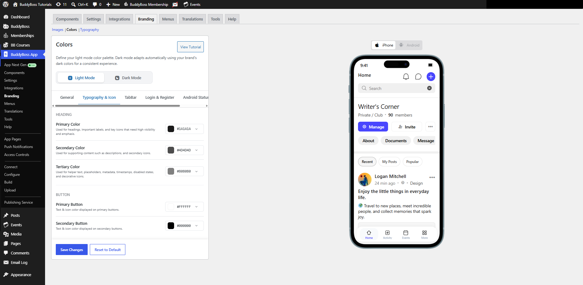
Heading
- Primary Color – Used for headings, important labels, and primary icons.
- Secondary Color – Used for descriptions and secondary icons.
- Tertiary Color – Used for helper text, metadata, timestamps, placeholders, disabled states, and decorative icons.
Button
- Primary Button – Controls the text and icon color displayed on primary buttons.
- Secondary Button – Controls the text and icon color displayed on secondary buttons.
Configure the Tab Bar
The TabBar tab lets you customize the appearance of the app’s bottom navigation bar.
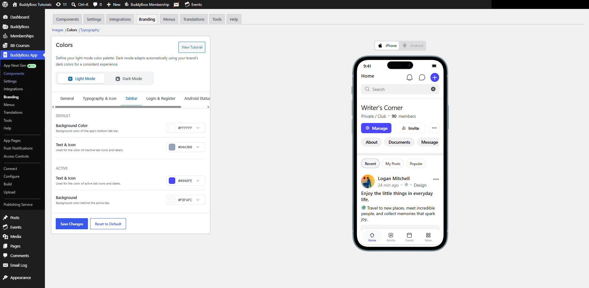
Default
- Background Color – Controls the background color of the bottom tab bar.
- Text & Icon – Controls the color of inactive tab icons and labels.
Active
- Text & Icon – Controls the color of active tab icons and labels.
- Background – Controls the background displayed behind the active navigation item.
Configure Login & Registration Colors
The Login & Register tab lets you customize the appearance of the app’s authentication screens.
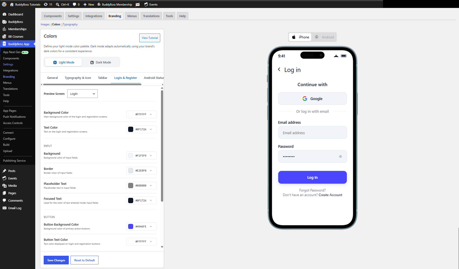
Preview Screen
Use the Preview Screen dropdown to switch between the Login and Register screens while previewing your changes.
Background
- Background Color – Controls the main background color of the selected screen.
- Text Color – Controls the text color displayed on the login and registration screens.
Input
- Background – Controls the background color of input fields.
- Border – Controls the border color of input fields.
- Placeholder Text – Controls the color of placeholder text displayed inside empty fields.
- Focused Text – Controls the color of text entered into active input fields.
Button
- Button Background Color – Controls the background color of primary action buttons.
- Button Text Color – Controls the text color displayed on primary action buttons.
Configure the Android Status Bar
The Android Status Bar tab lets you customize the appearance of the Android system status bar.
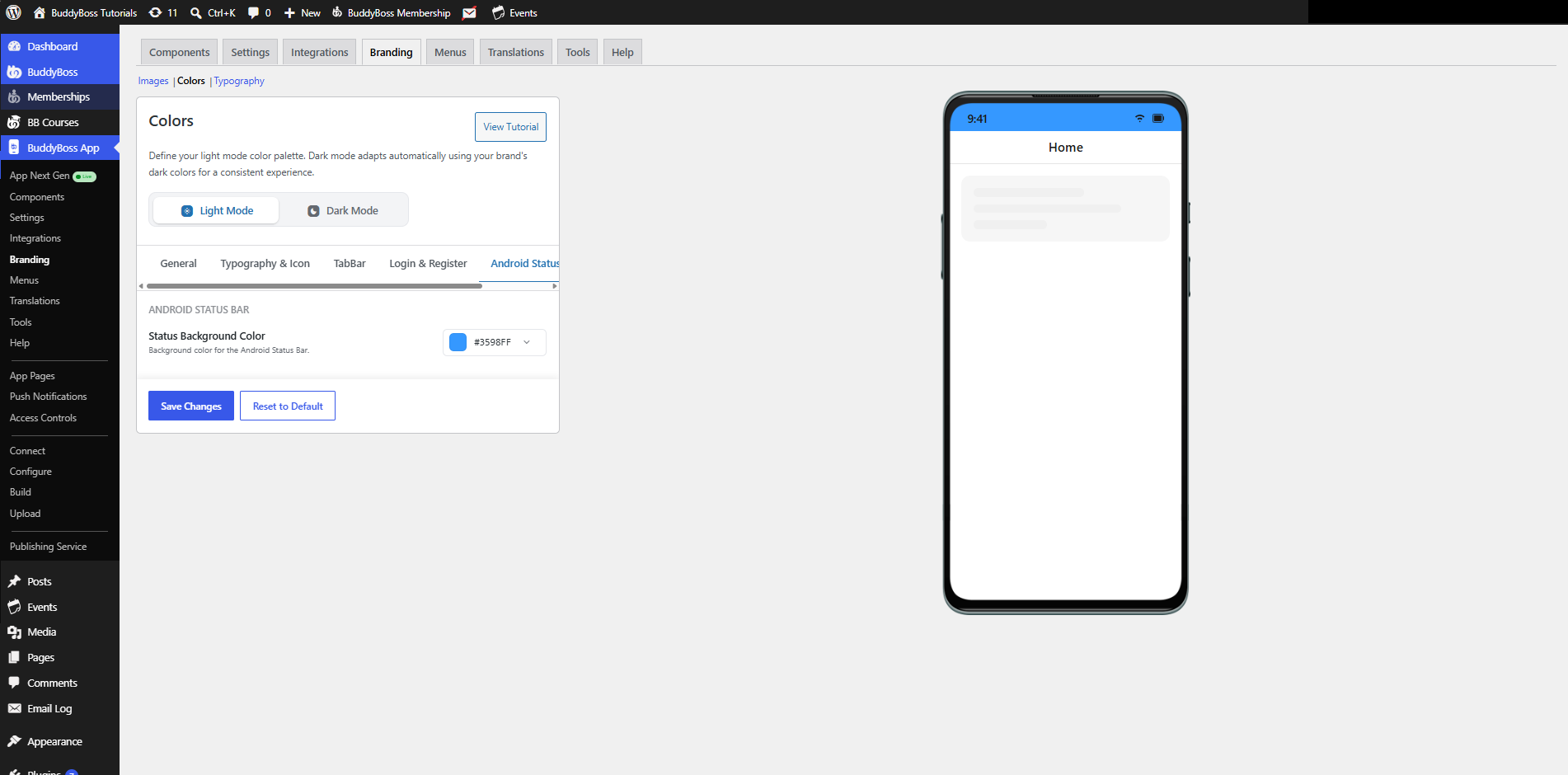
- Status Background Color – Controls the background color displayed behind the Android status bar.
Note: This setting only applies to Android devices.
Configure Status Colors
The Status tab controls the colors used for system notifications and status messages throughout the app.
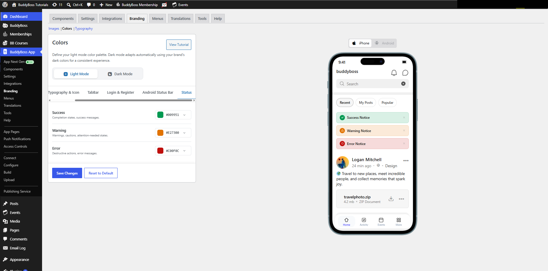
- Success – Used for successful actions and confirmation messages.
- Warning – Used for warnings, cautions, and informational alerts.
- Error – Used for validation errors, failed actions, and critical error messages.
Reset the Color Palette
If you want to restore the default BuddyBoss color palette:
- Navigate to BuddyBoss App > Branding > Colors.
- Click Reset to Default.
- Click Save Changes.
The default color palette will be restored for the currently selected Light Mode or Dark Mode configuration.